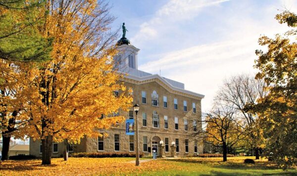
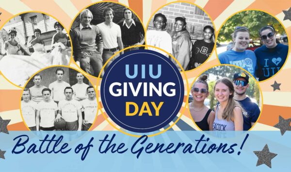
UIU Brand Guidelines
Logo and Wordmark Guidelines
Branding is about creating the same look and feel throughout the university to show unity even though there are several entities that make up our university. Varying identities is counter to our objectives and confusing for the public. Specific degree programs, extended locations, administrative departments and other offices should not print their individual "logos" in lieu of, or in addition to, the University logo, on any published material. Rather, each group can achieve representation with placement of their name or description (list where the center or affiliate’s name should be listed beneath the logo to create association).
The power of our brand is further enhanced by the use of a positioning statement: "Established in 1857" - this statement defines how long we have been an established university and the prestige we hold as a four-year institution.
On print materials the positioning statement should appear beneath the University logo, typeset in Berkeley Book , at ¾ the size of university text with minimum clear space.

Further, when adding a secondary message or division title please note that the font size and positioning should not exceed 50% of the size of the Wordmark from the logo. The positioning statement should always appear in the same color as the university wording, process black.

The Office of Marketing and Communications
In association with the University logo, a second static description should accompany all templates and advertisements. This static description is to provide a clear, concise and consistent message regarding our university educational delivery strength:
For all print, web-based and video formatted advertising; the statement “On Campus • Online • Independent Study • U.S. and International Centers” will be used in the footer section along with the appropriate division or location contact information and our main website address.
The university name should be listed on the first line, in all caps in a font size equivalent to area it placed, but not dominating the space. The second line should contain the contact information at no more than 50% of the size of the university’s name.
Departmental logos can be used at times to designate the different centers that make up Upper Iowa University. Center names should not extend beyond the line length of the words "UPPER IOWA UNIVERSITY – unless otherwise specified (see above). The name of the department should be set in the same color as rest of the text, process black.
If a departmental name is longer than a single line space allows, a line break should occur in the name. If a departmental name is shorter than a full, single line, kerning may not be adjusted to fill that line space.
Note: The images shown above are not to be saved or reproduced. They are shown here for informational purposes only. Please visit the official UIU downloadable page for copies of the UIU Wordmark.

